How to Conceptualize a Real-Time Data Visualization Framework
What is data visualization?
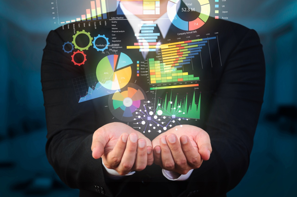
Data visualization is a form of communication that uses visual representations such as charts and graphs to convey important information about data sets. Data visualization tools help users create visuals from large data sets quickly, allowing them to better view trends in the data and identify important points of interest. These visual representations can be used for anything from business intelligence to scientific research and beyond.
Why use data visualization?
Data visualization is an effective way to quickly and easily convey complex information. By visualizing data, users can gain insight into patterns in the data that may not be obvious from looking at the raw numbers. This allows them to make better decisions based on the insights gained from the visuals and ultimately improve their decision-making process.
Additionally, data visualization can help people communicate complex information in a more intuitive way. By creating visuals of data, users can easily identify trends and outliers without having to analyze the raw numbers themselves. This makes data visualization an invaluable tool for anyone working with data sets.
What is real-time data visualization?
Real-time data visualization is a type of data visualization that allows users to track changes in data sets in real-time. This is done by creating visual representations of the data as it changes over time. Examples of real-time data visualization include things like network monitoring graphs, stock market charts, and other types of visuals that show how a set of data is changing with respect to time.
Real-time data visualization can be incredibly useful for tracking changes in data sets as they unfold. This allows users to quickly identify patterns and make decisions based on the information they are provided with. Additionally, this type of visualization is especially helpful when dealing with large data sets that may contain a lot of noise or outliers that need to be accounted for in order to draw meaningful conclusions.
Step-by-step data visualization framework
Creating a real-time data visualization framework requires the user to have an understanding of the data they are working with.
- Choose the type of visualization: The first step in creating a real-time data visualization framework is to choose the type of visualization that best suits the data set. This will depend on the type of data being visualized and the target audience of the visual. Popular types of visualizations include bar charts, scatter plots, and other charts and graphs.
- Choose the data source: The second step is to select the data source for the visualization. Depending on the type of data being visualized, the data source can range from a single file to a complex set of data points from multiple sources.
- Set up the data flow: The third step is to set up the data flow for the visualization. This involves connecting the data source to the visualization tool, such as the web page where the visualization will be hosted.
- Create the visual: The fourth step is to create the visual by using the data visualization tools available. This includes selecting the type of visualization, setting up the data points, and adding any additional features or styling to the visual.
- Check accuracy: The fifth step is to check the accuracy of the visual by comparing it to the data source. This is an important step to ensure that the visual is displaying the data correctly.
- Test for usability: The sixth step is to test the visualization for usability. This involves testing the visual on different devices and platforms to ensure that it can be used easily by the target audience.
- Monitor performance: The seventh and final step is to monitor the performance of the visualization. This includes tracking metrics such as page views, user engagement, and other data points that can provide insight into how the visual is performing.
The role of data visualization in decision making
Data visualization plays a crucial role in decision-making. By creating visual representations of data sets, users can quickly identify patterns and outliers that may not be obvious from just looking at the raw numbers. This allows them to make better decisions based on the insights gained from the visuals.
Real-time data visualization is especially helpful for tracking changes in data sets as they unfold. This allows users to quickly identify changes in the data and make decisions based on the most up-to-date information. Additionally, this type of visualization is especially useful for working with large data sets that may contain a lot of noise or outliers that need to be accounted for in order to draw meaningful conclusions.
Lumics network visualization
Lumics offers network visualization in just a few clicks, giving you a quick and efficient glimpse into what’s happening. Shared dashboards allow teams to focus on what they know and share. Once the dashboards are created, they can be shared with other teams, providing an equal visual for the entire environment. With Lumics, get a better view of your network in a snap!


